Likeminded – Building the design function behind one of Germany's leading workplace mental health platforms

Likeminded (now nilo.health) is a Berlin-based mental health platform offering therapy sessions, group formats, webinars and on-demand content for employees. I joined as its first senior product designer, shortly before the company bet its future on selling to HR rather than to individuals.

Design Leadership UX Brand Design Ops

Project Overview

When I joined, "design" meant an MVP an agency had shipped and a folder of inconsistent templates. No design system, no shared process with Product or Engineering, no clear owner for solution discovery, and no standard for how decisions got documented or reused. Marketing, Sales and Ops all needed design work, and all asked for it the same way: a Slack message, no context, no lead time.

I built the function end to end, then used it to carry the company through a pivot. I set the foundation for the web app and designed its core journeys, defined how Design, Product and Engineering worked together, hired and mentored the team, and led the design side of the move from B2C to B2B: a product reshaped around what HR buyers and their employees needed, a full rebrand with an external agency, and a new website to sell it.

The Outcome

The clearest signal it worked came back through sales calls. UX and UI became a consistent reason prospects picked us over larger, better-funded competitors, and the product, brand and story we shipped supported the company's Series A. Design stopped being a service desk and became a reason to buy.

Client

Likeminded (now nilo.health)

My role

Design Lead / Manager: product design, design ops and processes, hiring and mentoring, rebranding, website

Tools

Figma, Notion, Phrase, customer.io, Webflow, HubSpot

Platform

Web App | Website | Brand

Timeline

2021 - 2025

Our product UX became a consistent reason prospects picked us over larger competitors.

At a glance

Supported the Series A. The product, brand and story we shipped backed the company's raise

UX/UI became a competitive differentiator. Prospects consistently named it as a reason they chose us over larger competitors

A completed B2C → B2B pivot. Product, website and brand repositioned around the employer who buys and the employee who uses it

Design became a function, not a favour. Clear ownership, repeatable processes, a living design system and documented deliverables

A brand that could compete. Rolled out across product, website and every outbound material, with the site moved from Kirby to Webflow so Marketing could publish without Engineering

A team that could grow. Designers hired, onboarded and mentored into an embedded, cross-functional practice

How it started

Likeminded launched as a B2C platform: individuals booked group and one-to-one mental-health sessions on likeminded.care. Retention was the first problem I owned. A lot of people came to one or two group sessions and never came back.

The deeper issue was structural. Nobody could say where Product's ownership of discovery ended and Design's began. Kick-offs had no consistent shape. Without a design system, the website and the web app drifted visually apart. User stories, designs, prototypes and UX copy lived in different heads and different files.

Then the business changed underneath all of it. Selling to employers instead of individuals meant a different buyer, a different product story, and a market full of polished, well-funded competitors, while our brand still read "early-stage startup."

I treated it as two jobs running in parallel: ship what the business needed now, and build the operating system underneath so a team could scale.

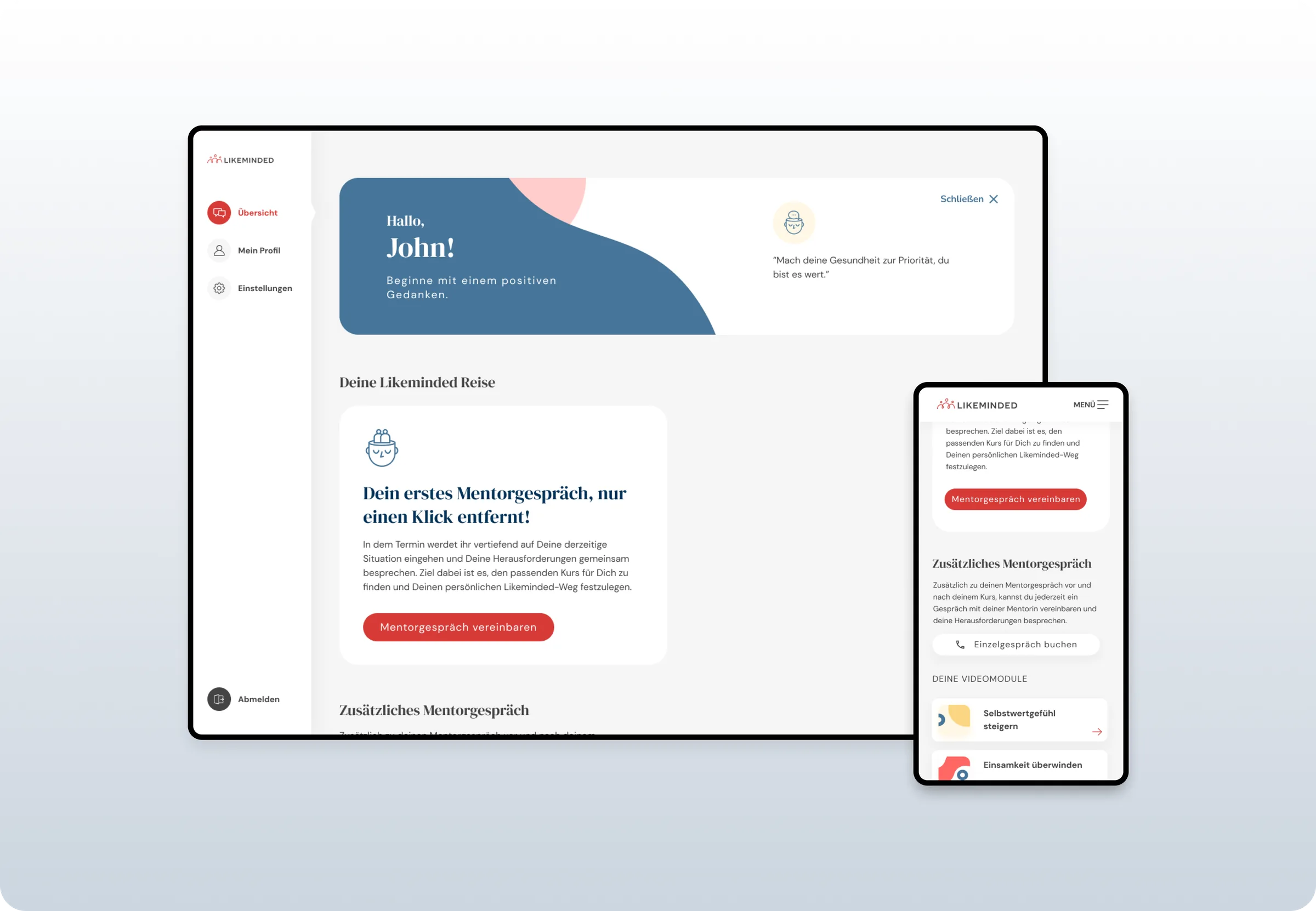
The inherited B2C app: the original red and navy interface, with the mentor session journey on desktop and mobile

Before. The inherited MVP.

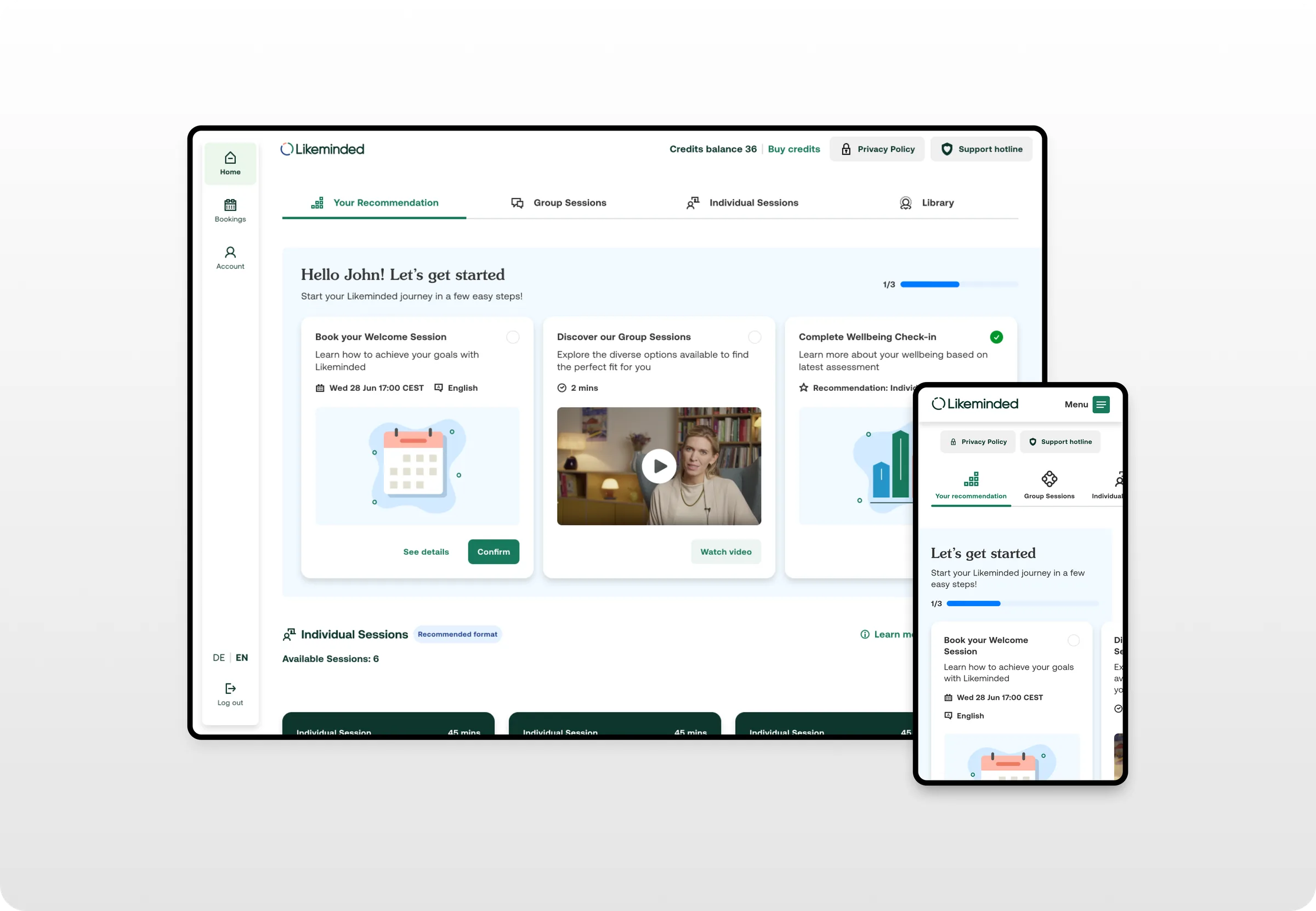
The rebuilt experience: personalised recommendations and a guided getting started checklist on desktop and mobile

After. The same journey once the system landed.

The principles we designed against

Before writing a single process doc, I wrote down what good looked like. I derived four design principles straight from the company values, so a disagreement about a design could be settled by something other than seniority or taste, and so Product, Engineering and Marketing had the same vocabulary for judging the work.

Integrity

Honest, undivided and consistent.

Effectiveness

Successful in producing the desired outcome.

Authenticity

Reliable and emotionally appropriate.

Empowerment

Supporting users to become stronger and more confident.

Underneath the principles sat two working rules that made them operational. Our design style is flat and reduced, with bold typography and icons and a focused use of colour. Our UX patterns are clear and intuitive, combining native and custom interactions to support the intentions of the user.

In a mental-health product, "reliable and emotionally appropriate" isn't a slogan. It's a testable standard, and it's the reason our UX copy went past the psychology team before it shipped.

Setting up the product foundation and designing core journeys

I expanded the agency-built MVP without breaking business continuity, adapting its UX and UI to our own vision and to stakeholder feedback. To fix retention we designed a two-part journey: a "Basic" track and a paid "Deep Dive" with an opt-out. It lifted revenue and kept more people engaged. I designed the flows around booked and upcoming events, attendance status, automatic bundle payment, the payment funnel and bundle module overviews.
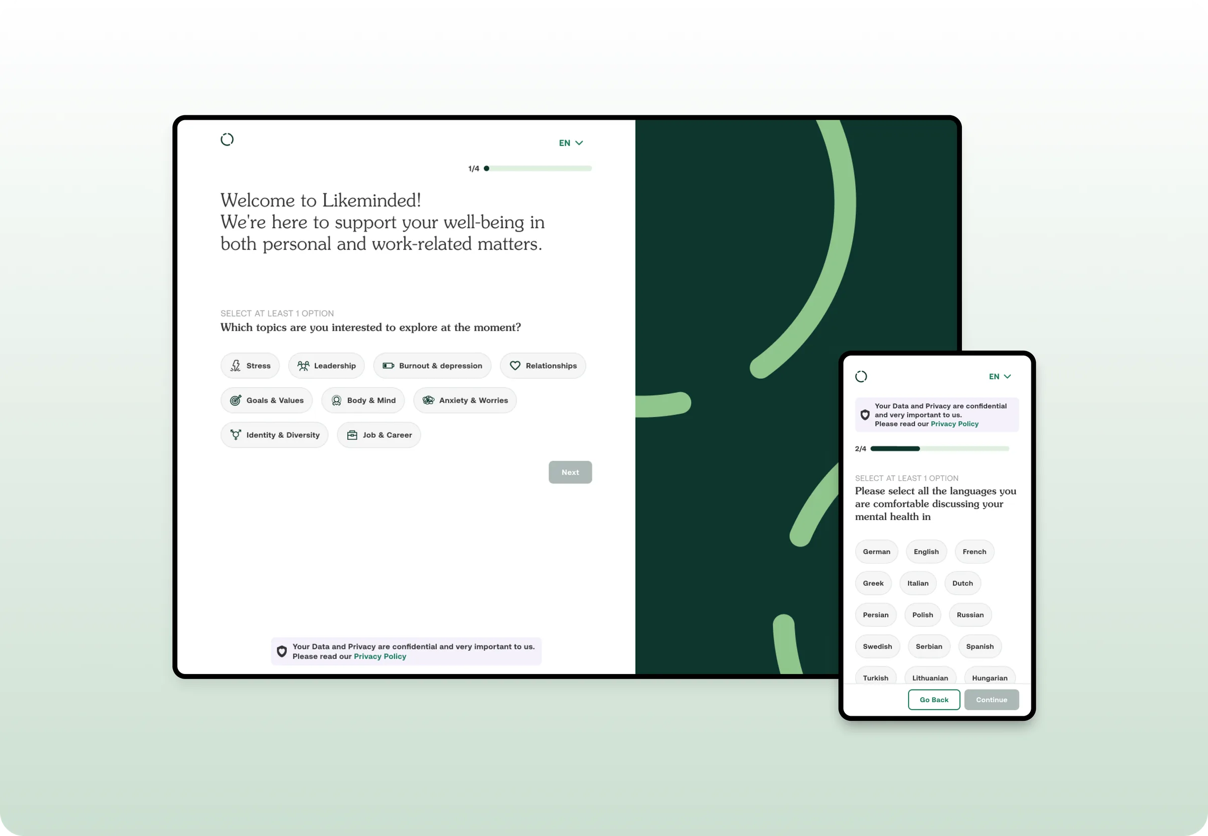
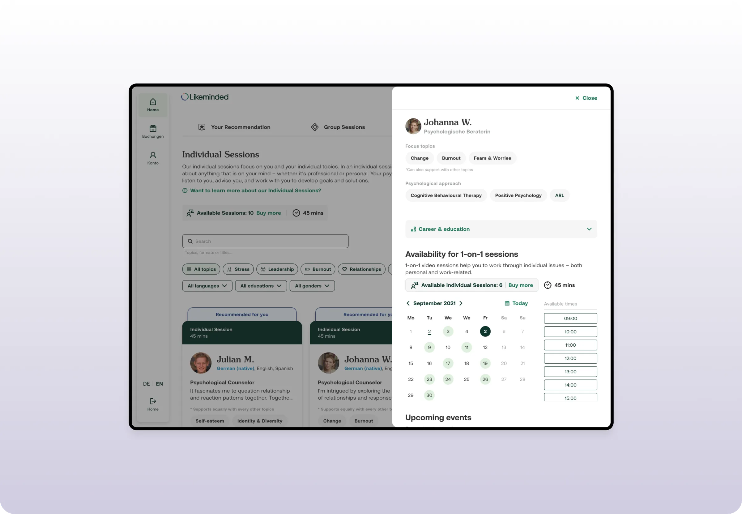
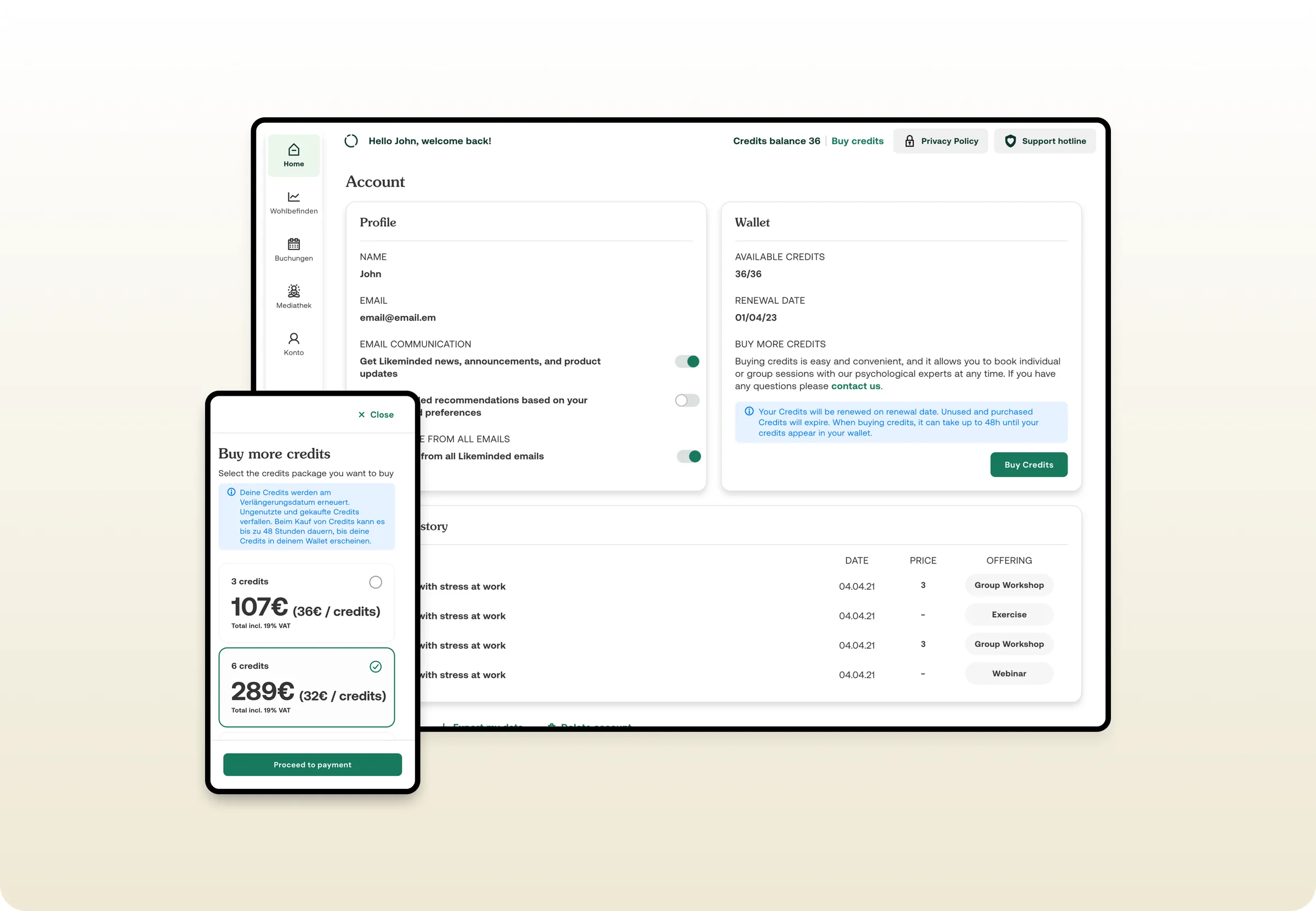
The onboarding flow: a four step wizard asking which topics the user wants to explore and which languages they are comfortable in Booking a session: the individual sessions list with filters, and a counsellor profile showing focus topics, approach and a calendar of available times The payment funnel: account wallet, credit balance and the buy more credits flow

Building our design system and standardizing documentation

I audited the type scale and colour styles to cut complexity and align with Engineering, then built the design system that kept the web app and the website coherent. I defined a tone of voice for the product and reworked all UX copy to match it, reorganised our Figma file structure, and set up documentation end to end, from validation with our psychology team through to localisation in Phrase, ready for new markets. Branding guidelines lived in a Notion wiki, next to a slide-deck template and email templates in customer.io.

The design system: UI patterns, typographic scale, colour styles and icon set

Design pivot of B2C to B2B

I ran research into what employers expect from a mental-health provider and shared it back across the company, then reframed the product from an individual sign-up to an employer-sponsored service. We expanded the offering: one-to-one sessions with psychological experts, group webinars and workshops, and a media library of meditations, exercises, readings and videos. I led an iterative overhaul of onboarding, introduced ML-driven recommendations based on a user's wellbeing, added a wellbeing tracker, and flattened navigation to as few layers as possible. I also worked with Sales on win/loss feedback and turned it into UX changes around ease of access, perceived quality of care and transparency about outcomes. Those were the three things prospects kept weighing us on.
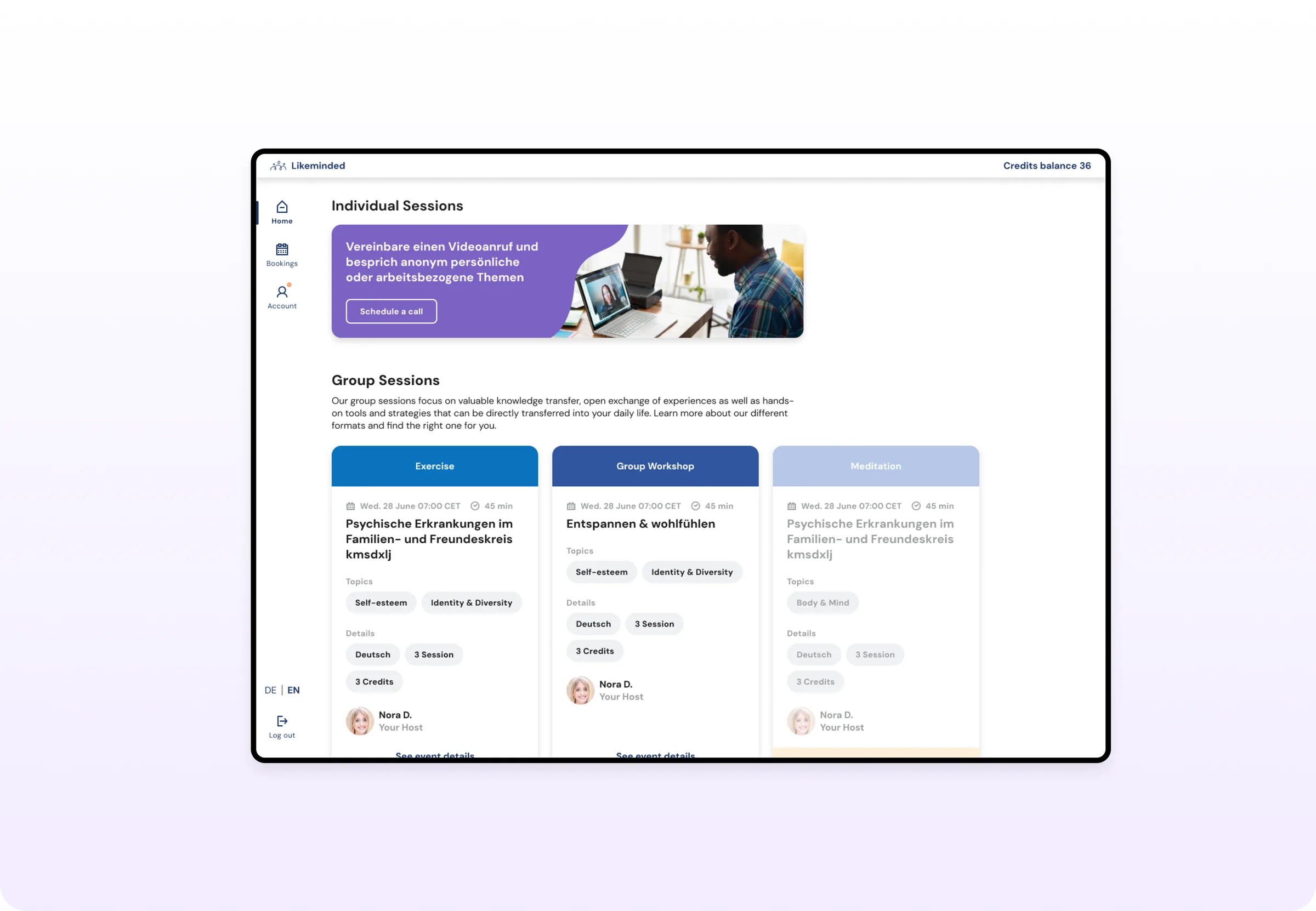
The consumer platform the pivot moved away from: individual and group sessions booked one at a time

Turning design into a function with a process

We ran a roles-and-responsibilities workshop with Product to settle who owned discovery, and reshaped kick-offs so we captured insights before jumping to solutions. I defined the operating cadence: exploration and sketching sessions with stakeholders, internal and cross-functional design reviews, concept and scope validation through research, feasibility checks with Engineering, and a clear standard for what a design deliverable includes. Templates for kick-offs and feasibility checks meant every initiative started the same way.
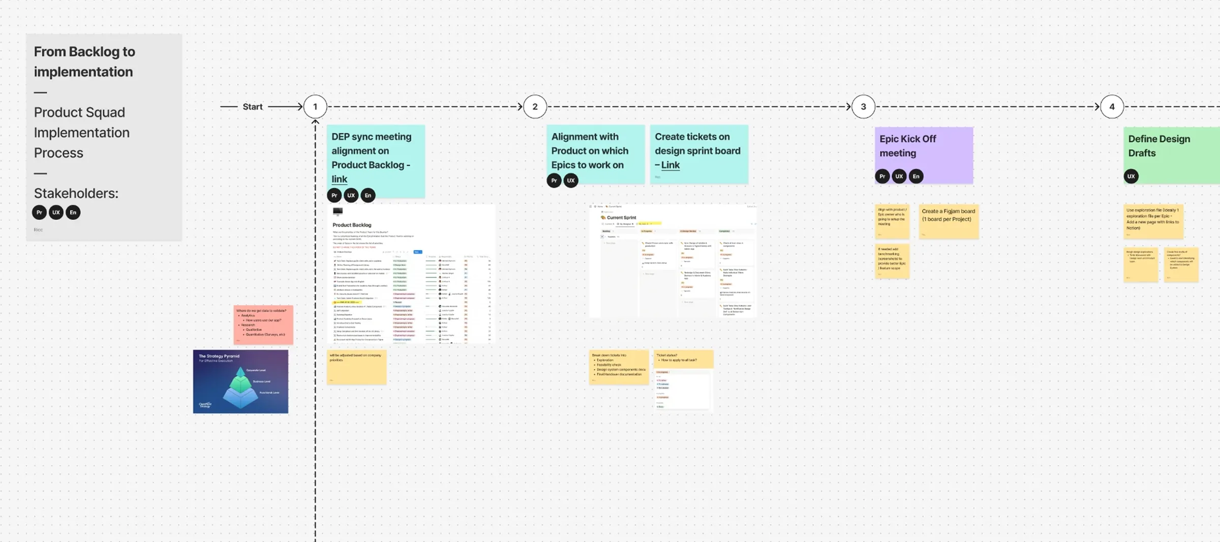
The product squad implementation process, from backlog to implementation: backlog sync, alignment with Product on epics, epic kick off, and design drafts, with the stakeholders involved at each step

Hiring and growing the team

I brought on and mentored a working student to improve delivery reliability, then hired a visual designer as we scaled, onboarding them straight into the rebranding project. Design reviews, syncs and retros gave the team a shared bar for quality and a way to agree on priorities out loud.

Enabling non product teams to work with design

They had no intake, no backlog owner and no lead times, only Slack requests. I introduced a ticketed backlog and weekly design sprints so requests arrived with the context needed to act on them, and communicated lead times and ownership at all-hands. With our visual designer I built the marketing brand system and templates that let those teams self-serve instead of queueing, and set up a process to document every print and digital CTA in HubSpot so campaign performance could actually be tracked.
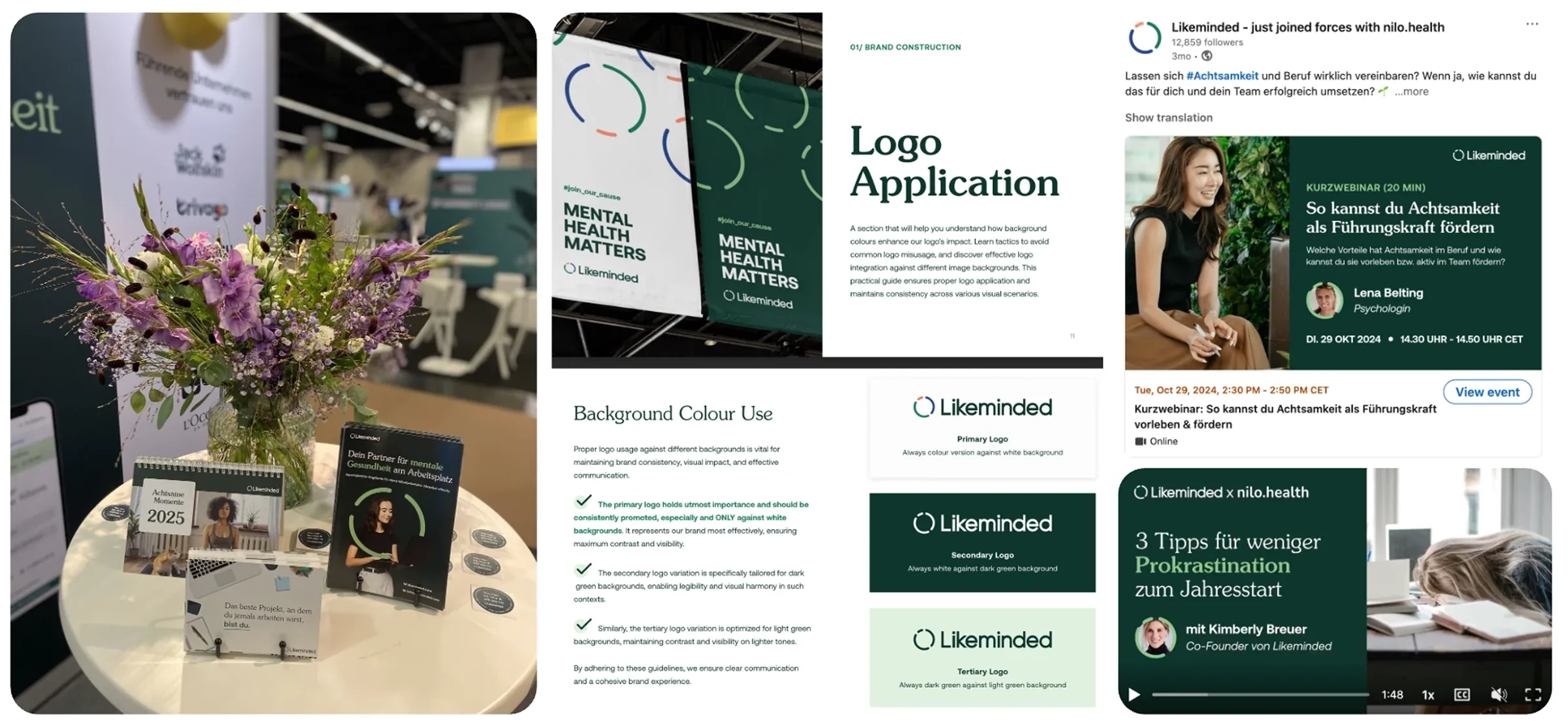
The marketing brand system in use: trade show stand and printed collateral, the logo application guidelines, and campaign and webinar graphics for social

Rebranding Likeminded

Competing for HR budget required a brand that read trustworthy and human rather than scrappy. I aligned with an external agency on tone of voice, strategy and visual language, expanded their concept into a formalised look and feel, and led its rollout across every team and department. The internal design team built the new marketing and social templates; I ran shareback sessions and wrote the guidelines that made adoption company-wide rather than design-only.
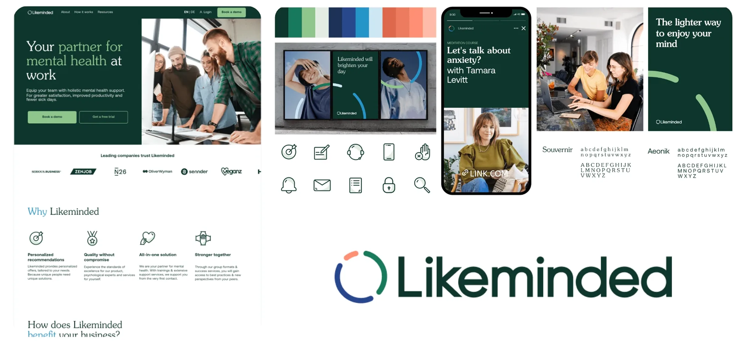
The new brand system: logo, colour palette, icon set, typography and the redesigned marketing site and social applications

Rebuilding the website for the B2B buyer

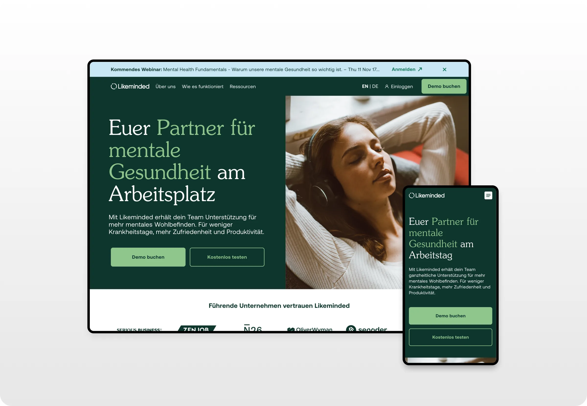
I led the planning and implementation of a new marketing site, defining the architecture and content priorities with Marketing and migrating from Kirby to Webflow so content updates no longer needed Engineering. A Webflow partner built the first landing and resources pages; I implemented the rest myself, including about and how it works. The new site made the B2B value proposition legible to HR decision-makers, added CTAs to capture leads, and gave HR partners a resources section of their own.

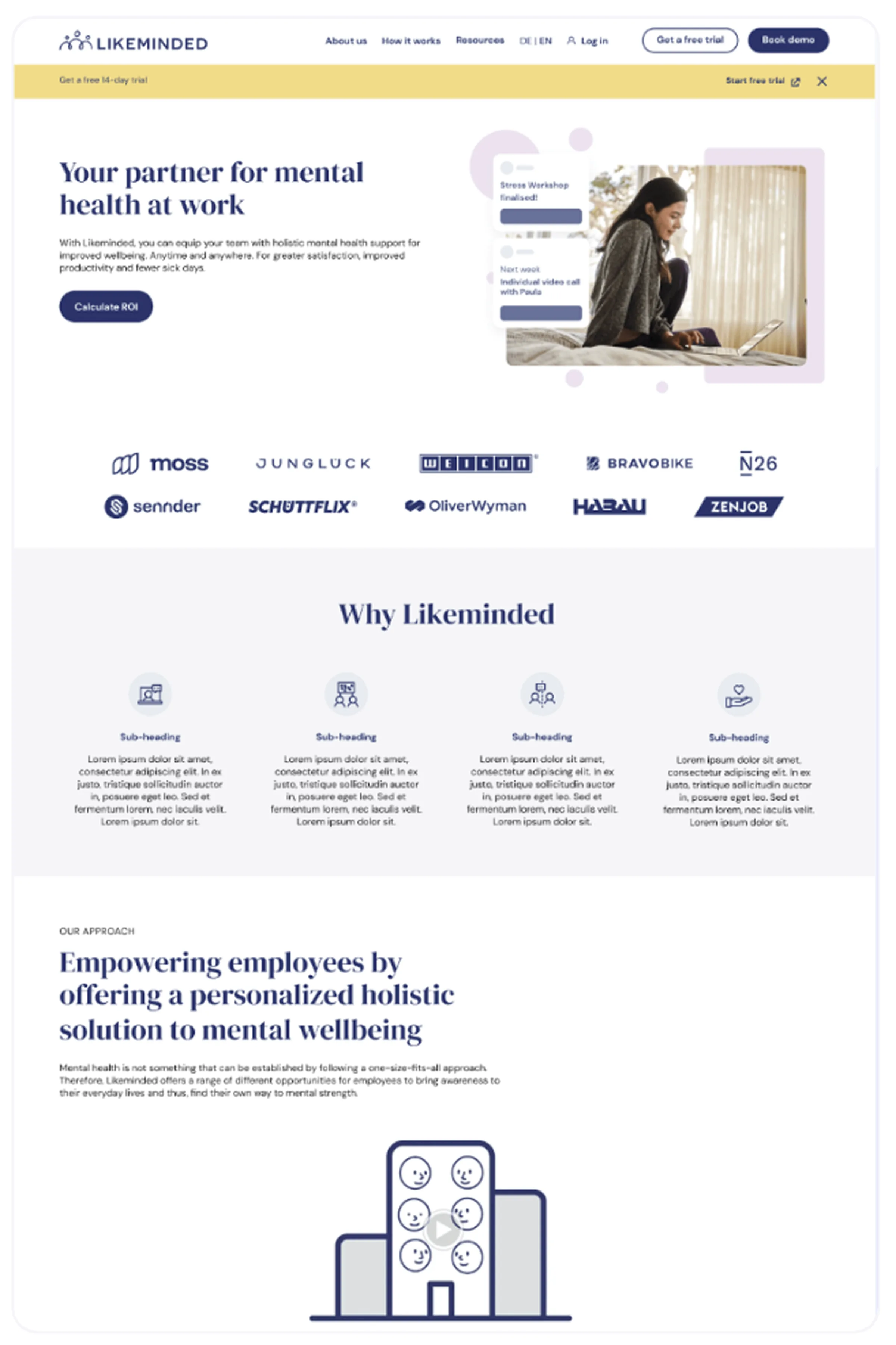
The website before the rebuild: the previous navy identity and placeholder copy on the marketing site
The rebuilt marketing site: the new green identity, a clearer value proposition for HR buyers and demo and trial calls to action, on desktop and mobile

Additional Discussion

  • Built the conditions that let design keep getting better after I stepped back from any single project
  • Process templates that still shape how initiatives start
  • A design system that still keeps the product coherent
  • Non-product teams that still get design work without a bottleneck in the middle
  • A reputation, in the market, that our craft was worth choosing us for. The hardest of these to manufacture, and the one I'm proudest of